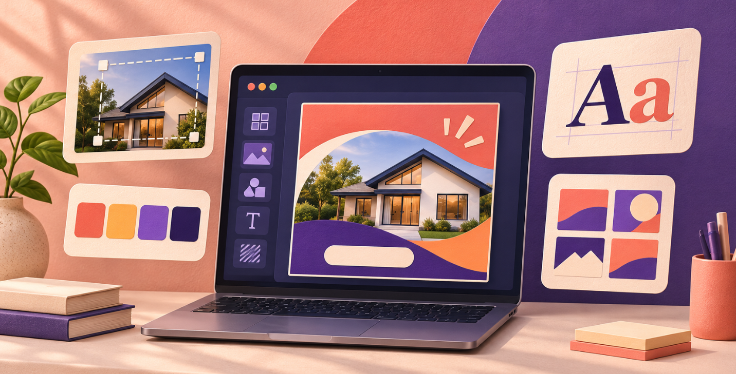
Need to promote an offer, introduce a service, or create a social media post? Adobe Express lets you start with a template and customize it for your business, making your first design easier to approach.
The application offers both free and paid features. For a first project, focus on one clear goal, a straightforward message, and a final check before sharing.
In this guide, we’ll use the example of a small business promoting an open house. You can follow the same process for a workshop, product launch, or service announcement.
1. Define Your Message Before Choosing a Template
Start by writing down the essential information:
- What you’re announcing.
- Who it’s for.
- The date or promotional period.
- The location, if relevant.
- What you want the reader to do next.
For example: “Visit our workshop Saturday, from 10 a.m. to 4 p.m. Admission is free. Reserve your demonstration.”
Your design should communicate its purpose within a few seconds. If your draft includes five selling points, three offers, and several contact options, choose a priority.
Additional details can go in the social media caption or on the page you direct readers to.
This preparation helps you choose a template that fits your message. Otherwise, you might spend time customizing an attractive layout only to discover that the important information doesn’t fit.
2. Open Adobe Express and Choose Your Format
You can explore Adobe Express and start creating to begin your project.
First, decide where the design will appear: a social media feed, a story, a printed flyer, or another supported format. Available options and labels may vary with the interface.
Think about where people will actually see your design. A flyer that looks clear on a large monitor may become difficult to read on a phone.
For our open-house example, start with one post for the platform your business already uses. Prepare other versions after you’ve approved the main message.
This keeps revisions manageable. Correcting a date in one design is easier than finding the same mistake across six different versions.
3. Choose a Template That Fits Your Goal
Templates provide a starting point for arranging text, images, and other elements.
Look for a layout that suits your announcement: a visible headline, space for a useful image, and enough room for practical details.
Evaluate the structure before the colors. You can change a color palette, but simplifying an overcrowded layout may take more work.
Before investing time in a template, check whether any included elements require a paid plan. This can help you avoid reaching the download stage with a design that depends on assets you don’t intend to purchase.
For your first project, a simple layout with fewer elements is usually easier to personalize and review.
4. Replace the Text With a Clear Reading Order
Give your design three levels of information:
- A headline that communicates the main announcement.
- A short sentence explaining why it matters.
- Practical details and a clear call to action.
For our example, “Open House” could be the headline. The next line explains what visitors can discover, followed by the date, address, and reservation instructions.
Remove any placeholder text left in the template. Check small labels, sample contact details, and decorative text boxes.
For U.S. and Canadian audiences, spelling out the month can make dates easier to understand. “November 21” is clearer than a numeric date that readers might interpret differently.
Keep the call to action specific. “Reserve your demonstration” gives readers a clearer next step than “Learn more” when booking is the goal.
5. Customize Colors, Images, and Branding
Use your business colors without introducing too many variations. A background color, a primary color, and one accent color are enough to begin.
Make sure the text contrasts clearly with the background. A strong image won’t help if readers struggle to find the date or understand the offer.
Use a real product or team photo when it adds useful context. Make sure you have permission to use the image and that it represents the offer accurately.
Keep your logo at a reasonable size. Readers should understand the announcement before examining every branding detail.
For more application discoveries and practical digital advice, explore Enzvia’s Internet section.
6. Review the Design at a Smaller Size
Reduce the preview size to approximate how the design might appear on a phone. Can you still identify the subject, date, and next step?
Ask someone else what they understand after a quick look. If their answer differs from your goal, simplify the design.
Then check the details:
- Business and product names.
- Prices and currency.
- Dates and opening hours.
- Location.
- Offer conditions.
- Call-to-action wording.
If an offer targets both U.S. and Canadian customers, identify the currency clearly, such as US$ or CA$, as appropriate.
For online events, include the time zone. For in-person events, a clear location may be more helpful than another decorative element.
7. Download the Right File Type
Adobe documents several download formats depending on the creation, including PNG, JPEG, PDF, and MP4.
For a static online design, review the available PNG or JPEG options. For printed material, check the PDF settings and ask your printer about its requirements.
Open the downloaded file before distributing it. Review the exported design itself, including text clarity, image quality, and any unexpected changes.
If you want to present several JPG or PNG versions in one review document, our free images-to-PDF converter can combine them into a PDF with one image per page.
That can be useful for internal approval. For professional printing, use the file format and production settings requested by your print provider.
8. Start With the Free Plan and Upgrade for a Specific Need
Adobe lists a free plan and paid options on its Adobe Express plan comparison page.
Available assets, advanced tools, and AI allowances depend on the plan. Pricing and promotions can also vary by country and billing arrangement.
Begin by checking whether the free plan supports your first project. Consider a paid feature when it solves a recurring problem or supports work you regularly produce.
Your first goal is a clear, accurate design that’s ready to share. Once you have that, keep a record of the colors, wording, and layout choices that worked.
Those decisions can become the foundation for future posts, helping your business build a more consistent visual identity with less preparation each time.