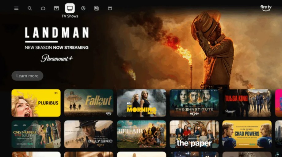
Most streaming apps focus on content libraries, recommendations, or exclusive shows. But Amazon’s latest Fire TV mobile app update targets a different problem.
Navigation.
For years, streaming interfaces have struggled with a basic issue: discovering something to watch is often slower than watching it. Endless menus, slow remotes, and scattered watchlists break the flow of a viewing session.
Amazon’s redesign attempts to address that friction by turning the Fire TV mobile app into something more ambitious than a simple companion tool.
The phone becomes the control layer of the entire streaming experience.
What Actually Changed in the Fire TV Mobile App
The update focuses less on flashy features and more on structure.
Amazon reorganized the app around five main tabs:
-
Remote
-
Home
-
Search
-
Watchlist
-
Account
This layout intentionally mirrors the interface found on Fire TV devices. At first glance, the change may seem minor. In practice, it solves one of the most frustrating aspects of multi-device ecosystems: inconsistent navigation between screens.
Users no longer need to relearn how to move through menus depending on whether they are using a remote or a phone. The logic stays the same.
The mobile device stops feeling like a secondary tool and starts functioning as an extension of the television interface.
Why Streaming Discovery Is Moving to Smartphones
Streaming habits have quietly shifted.
Most viewers no longer discover shows while actively watching television. Discovery often happens elsewhere: scrolling through social media, messaging friends, or browsing content recommendations on a phone.
Amazon’s redesign acknowledges this behavioral reality.
With the new Fire TV mobile experience, users can:
-
Browse streaming libraries directly from their phone
-
Add movies or shows to their watchlist instantly
-
Launch playback on their TV without navigating multiple on-screen menus
The smartphone becomes the discovery engine, while the television remains the display.
The Hidden Problem Amazon Is Trying to Solve
Streaming platforms compete heavily on content. But user frustration often has little to do with catalog size.
The real problem is friction.
Small interruptions accumulate during a typical viewing session:
-
searching across multiple services
-
navigating slow television menus
-
switching between apps and remotes
Each interruption breaks immersion.
Amazon”s redesigned Fire TV mobile app aims to reduce those moments. Faster browsing, easier list management, and consistent navigation combine to make the experience smoother.
The improvement is subtle. But subtle improvements often shape long-term user behavior.
What This Change Reveals About Amazon’s New Fire TV Mobile Streaming Interfaces
Smart TVs were originally designed with a simple assumption: the television itself would be the main interface.
That assumption is weakening.
As streaming ecosystems grow more complex, control increasingly shifts to secondary devices such as smartphones and tablets. These devices are faster, easier to navigate, and already central to everyday digital habits.
Amazon’s Fire TV mobile redesign reflects this broader shift.
The television remains the screen.
But the interface is gradually migrating elsewhere.
For many users, the real streaming remote is no longer the device on the coffee table.
It is the one already in their pocket.